Enterprise Design System
Design System - UI KIT
Built a scalable design system to unify brand and UI across multiple products, improving consistency, delivery speed, B2B and B2C readiness.
My Role :
Design System Designer
Industry :
Enterprise
Year(s) :
2022-2023
Project Duration :
12 weeks
Tools :
Adobe Creative XD, JIRA and Mural
Project Overview
Problem
As Indegene scaled, we expanded into multiple products and modules under our enterprise portfolio. Each team shipped quickly, but the user experience started to fragment:
UI components looked different across products (buttons, forms, typography, spacing)
Interaction patterns weren’t consistent (validation, empty states, navigation behavior)
The same “enterprise brand” didn’t show up consistently across the suite
My Responsibilities
Primary goal:
Create a scalable design system that establishes a consistent brand and user experience across Indegene’s enterprise solutions, so the suite feels unified and trustworthy for B2B and B2C customers.
Supporting goals:
Standardize foundations (color, typography, spacing, grid, icon usage)
Build reusable, documented components and patterns
Reduce UI variation and prevent new inconsistencies
Improve speed of design + development delivery through reuse
Enable cross-team collaboration with a single source of truth
Research
To make sure the design system solved real problems (not just visual inconsistency), I started with lightweight but structured research across products, teams, and workflows.
Step 1: UI & component audit (across multiple products)
Reviewed key screens across Indegene’s enterprise suite (core flows + high-traffic modules)
Cataloged repeated components (buttons, inputs, tables, navigation, modals)
Logged inconsistencies in:
visual style (colors, typography, spacing, icon usage)
interaction behavior (hover/focus/disabled, validation, empty states)
layout patterns (grid, alignment, density)
Output: A component inventory + inconsistency tracker highlighting “most reused + most inconsistent” elements to prioritize first.

2. Stakeholder + team workflow interviews (fast alignment)
I spoke with a small set of cross-functional partners to understand pain points and adoption constraints:
Product designers (what slows design down, what gets debated repeatedly)
Engineers (what’s hard to standardize, reusable patterns they need)
What I looked for:
Where teams were duplicating work
Which UI decisions caused repeated review cycles
What “enterprise readiness” meant for demos and B2B trust
Output: Shared themes + priorities for system scope (foundations → core components → enterprise patterns).
Brand alignment + enterprise consistency check
Mapped current product UI to Indegene’s brand expectations
Identified where brand expression broke across products (especially color, typography, hierarchy)
Defined what “consistent enterprise suite” should feel like (tone, density, clarity, professionalism)
Output: A set of “north star” principles to guide decisions (e.g., consistency > customization, accessibility by default, scalable tokens).
4) Prioritization framework (what to build first)
To avoid boiling the ocean, I used a simple prioritization approach:
High frequency (used across many products)
High risk (causes confusion or errors)
High visibility (seen in demos / first impressions)
High effort savings (big rework reduction)
First-wave focus: Buttons, form fields, navigation, tables, and system states (error/loading/empty).
Brainstorming + SKETCHING


Competitive ANalysis
I researched several industry-leading design systems to understand how mature teams structure foundations, scale components, ensure accessibility, and maintain governance across large product ecosystems. Studying what these systems do well gave me a strong starting point, clear best practices to borrow, common pitfalls to avoid, and a proven blueprint to adapt for Indegene’s multi-product enterprise suite.
Design
First Draft

I started by translating our research into a basic starter kit, enough structure for teams to begin aligning quickly. This first version focused on the essentials: core brand colors, typography styles, spacing defaults, and a small set of high-usage components (buttons, inputs, basic navigation). The goal of Draft 1 was speed and clarity: create a single visual direction and reduce the most obvious inconsistencies across products.
SECOND Draft

After sharing Draft 1 with designers and engineers, I iterated based on real feedback and real product edge cases. In Draft 2, I didn’t just refine visuals; I restructured the system into clear layers. Hence, it was easier to adopt and scale: Foundations (tokens and naming), Components (variants and interaction states such as hover, focus, disabled, loading), and Patterns for recurring enterprise workflows. That’s where I expanded into the areas teams kept running into: form validation and error messaging, tables, empty states, and loading behaviors, and added practical usage guidance (when to use / when not to), so the system functioned like a true source of truth rather than just a component file.
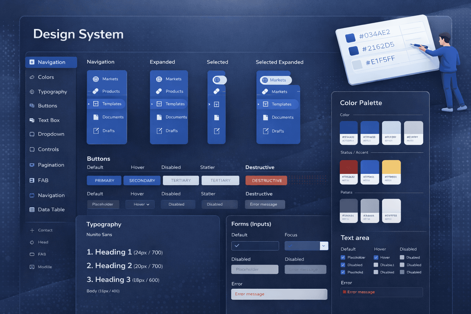
Final Version
Outcome
Outcome-wise, the work led to all products within Indegene being re-aligned to the new design system guidelines, creating a much more consistent enterprise brand experience across the suite. To kickstart adoption, I helped build the first set of updated screens using the new components and patterns, so teams could clearly see what “good” looked like, understand the shift, and apply it to their own modules with less ambiguity. I also pitched the rationale and approach to stakeholders, setting expectations that implementing a full UI kit across multiple products would take time, and that success would depend on steady advocacy and enablement without disrupting active delivery. It required continuous alignment, practical support, and change management, while keeping teams moving. This remains one of the projects I’m most proud of because it wasn’t just design output; it was driving real cross-product consistency and long-term scalability.
Enterprise Design System
Design System - UI KIT
Built a scalable design system to unify brand and UI across multiple products, improving consistency, delivery speed, B2B and B2C readiness.
My Role :
Design System Designer
Industry :
Enterprise
Year(s) :
2022-2023
Project Duration :
12 weeks
Tools :
Adobe Creative XD, JIRA and Mural
Project Overview
Problem
As Indegene scaled, we expanded into multiple products and modules under our enterprise portfolio. Each team shipped quickly, but the user experience started to fragment:
UI components looked different across products (buttons, forms, typography, spacing)
Interaction patterns weren’t consistent (validation, empty states, navigation behavior)
The same “enterprise brand” didn’t show up consistently across the suite
My Responsibilities
Primary goal:
Create a scalable design system that establishes a consistent brand and user experience across Indegene’s enterprise solutions, so the suite feels unified and trustworthy for B2B and B2C customers.
Supporting goals:
Standardize foundations (color, typography, spacing, grid, icon usage)
Build reusable, documented components and patterns
Reduce UI variation and prevent new inconsistencies
Improve speed of design + development delivery through reuse
Enable cross-team collaboration with a single source of truth
Research
To make sure the design system solved real problems (not just visual inconsistency), I started with lightweight but structured research across products, teams, and workflows.
Step 1: UI & component audit (across multiple products)
Reviewed key screens across Indegene’s enterprise suite (core flows + high-traffic modules)
Cataloged repeated components (buttons, inputs, tables, navigation, modals)
Logged inconsistencies in:
visual style (colors, typography, spacing, icon usage)
interaction behavior (hover/focus/disabled, validation, empty states)
layout patterns (grid, alignment, density)
Output: A component inventory + inconsistency tracker highlighting “most reused + most inconsistent” elements to prioritize first.
2. Stakeholder + team workflow interviews (fast alignment)
I spoke with a small set of cross-functional partners to understand pain points and adoption constraints:
Product designers (what slows design down, what gets debated repeatedly)
Engineers (what’s hard to standardize, reusable patterns they need)
What I looked for:
Where teams were duplicating work
Which UI decisions caused repeated review cycles
What “enterprise readiness” meant for demos and B2B trust
Output: Shared themes + priorities for system scope (foundations → core components → enterprise patterns).
Brand alignment + enterprise consistency check
Mapped current product UI to Indegene’s brand expectations
Identified where brand expression broke across products (especially color, typography, hierarchy)
Defined what “consistent enterprise suite” should feel like (tone, density, clarity, professionalism)
Output: A set of “north star” principles to guide decisions (e.g., consistency > customization, accessibility by default, scalable tokens).
4) Prioritization framework (what to build first)
To avoid boiling the ocean, I used a simple prioritization approach:
High frequency (used across many products)
High risk (causes confusion or errors)
High visibility (seen in demos / first impressions)
High effort savings (big rework reduction)
First-wave focus: Buttons, form fields, navigation, tables, and system states (error/loading/empty).
Brainstorming + SKETCHING
Competitive ANalysis
I researched several industry-leading design systems to understand how mature teams structure foundations, scale components, ensure accessibility, and maintain governance across large product ecosystems. Studying what these systems do well gave me a strong starting point, clear best practices to borrow, common pitfalls to avoid, and a proven blueprint to adapt for Indegene’s multi-product enterprise suite.
Design
First Draft
I started by translating our research into a basic starter kit, enough structure for teams to begin aligning quickly. This first version focused on the essentials: core brand colors, typography styles, spacing defaults, and a small set of high-usage components (buttons, inputs, basic navigation). The goal of Draft 1 was speed and clarity: create a single visual direction and reduce the most obvious inconsistencies across products.
SECOND Draft
After sharing Draft 1 with designers and engineers, I iterated based on real feedback and real product edge cases. In Draft 2, I didn’t just refine visuals; I restructured the system into clear layers. Hence, it was easier to adopt and scale: Foundations (tokens and naming), Components (variants and interaction states such as hover, focus, disabled, loading), and Patterns for recurring enterprise workflows. That’s where I expanded into the areas teams kept running into: form validation and error messaging, tables, empty states, and loading behaviors, and added practical usage guidance (when to use / when not to), so the system functioned like a true source of truth rather than just a component file.
Final Version
Outcome
Outcome-wise, the work led to all products within Indegene being re-aligned to the new design system guidelines, creating a much more consistent enterprise brand experience across the suite. To kickstart adoption, I helped build the first set of updated screens using the new components and patterns, so teams could clearly see what “good” looked like, understand the shift, and apply it to their own modules with less ambiguity. I also pitched the rationale and approach to stakeholders, setting expectations that implementing a full UI kit across multiple products would take time, and that success would depend on steady advocacy and enablement without disrupting active delivery. It required continuous alignment, practical support, and change management, while keeping teams moving. This remains one of the projects I’m most proud of because it wasn’t just design output; it was driving real cross-product consistency and long-term scalability.